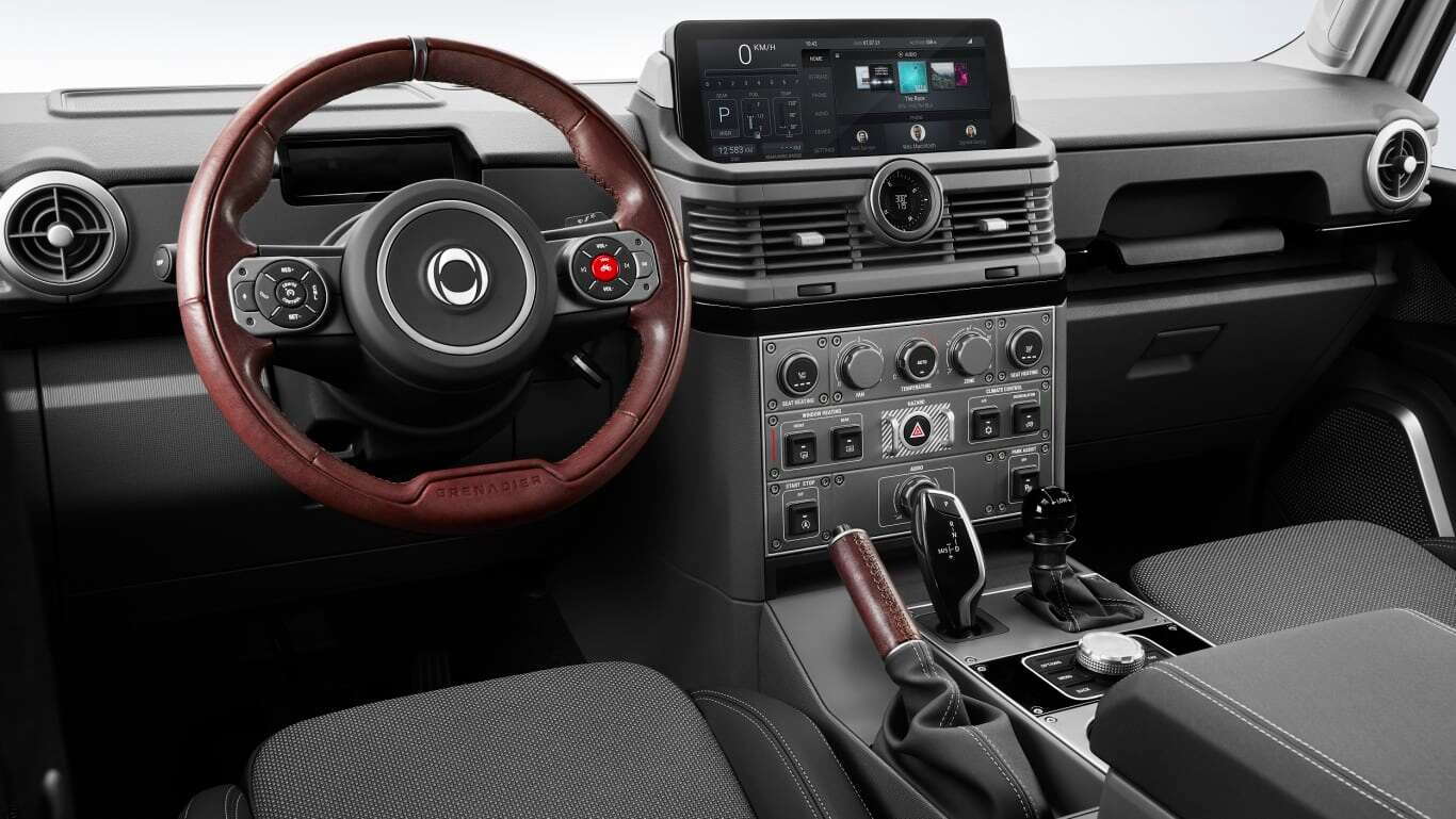
Ineos Grenadier unveils the ugliest interior ever
#1
#2
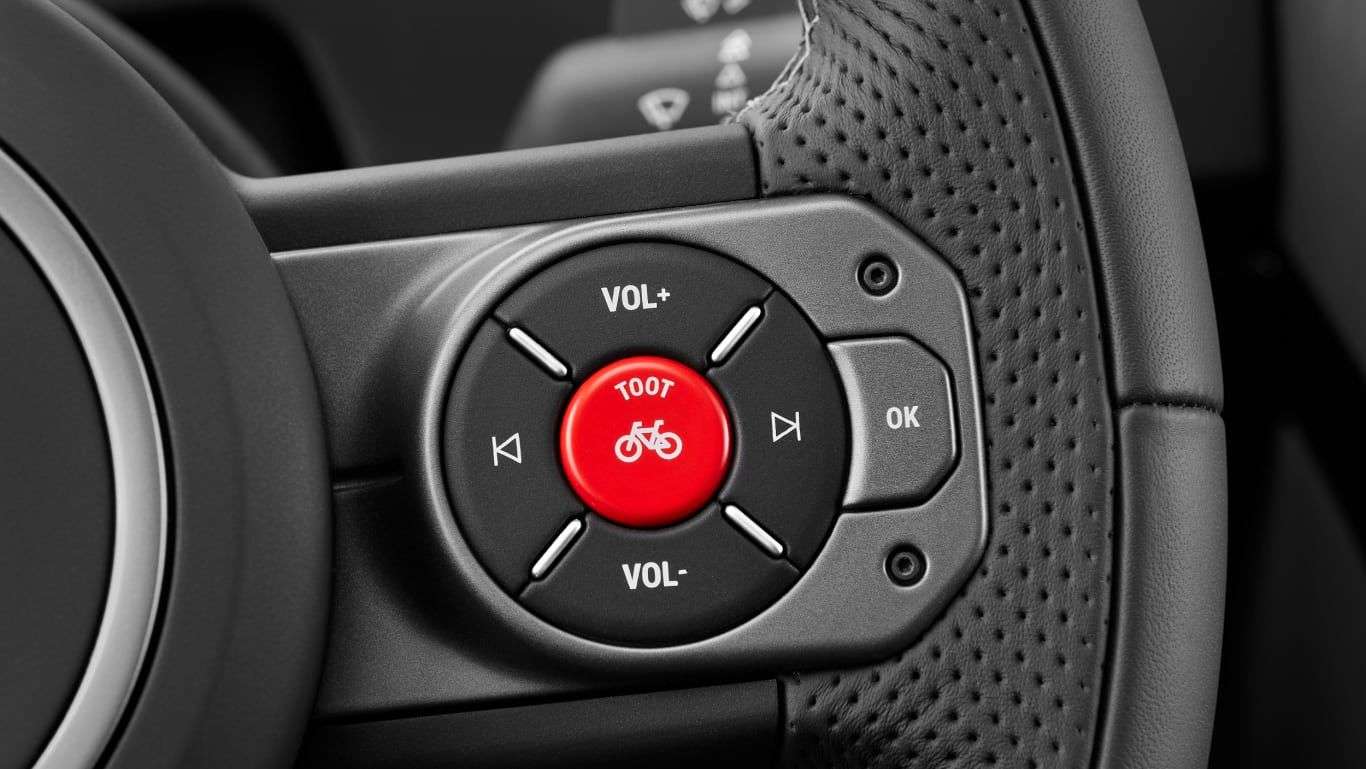
Other than the BMW gear stick, I think it looks ok. The toot button is a special �softer� horn sound for when you come up behind cyclists. Toot your horn to let them know you are about to pass�especially for Ineos sponsored teams apparently. The main (full loud) horn is for Prius drivers to get out of your way fast.
Not a vehicle I would likely buy as I don�t drive off road.
Not a vehicle I would likely buy as I don�t drive off road.
#4
The following 8 users liked this post by PaulLR:
ahab (07-08-2021),
DonMitsu (07-09-2021),
drcoop (07-08-2021),
GrouseK9 (07-08-2021),
Mechano2020 (07-08-2021),
and 3 others liked this post.
#5
Sure, rockers and pushbuttons are great. Every truck marketing campaign in the last 25 years (including this one) has touted "big controls for gloves" and "the most used controls in the most convenient layout".
It's tired rhetoric though. It's a basic expectation now. And, to me, Ineos failed.
Cringe at the I-Drive, moving the speedometer/driver info to the center display (no mention of a HUD and one article said the little screen behind the wheel is for indicator lights only), turning the menu selector button into "toot" button, giving the hazards prominent real estate with exaggerated graphics and guards, using mis-matched AC vents that look like cheap 90's GM surplus, and incredibly poor use of steering wheel controls. Cruise takes up half of the real estate so other controls lose out. The audio track/station buttons should be stacked vertically instead of having to move your thumb in and out. There is no audio source selector...
It's just poorly thought out.
The following users liked this post:
PaulLR (07-08-2021)
#6
There are some positives; but as with the Tesla, this is what happens when rich guys think they can design cars (or interfere in the design process). Better to leave this stuff to professionals
I like the switch labelling and the modularity of the centre console (inspired by planes or race cars?), but much of the rest is a disaster
I like the switch labelling and the modularity of the centre console (inspired by planes or race cars?), but much of the rest is a disaster
The following 3 users liked this post by DoctorofRocks:
#7
#8
No, not only real - but it goes further. The entire picture (headliner/etc) makes it look like a commercial jet. In the link below is a video where they discuss the interior design.
https://uk.motor1.com/news/518611/in...otos-revealed/
https://uk.motor1.com/news/518611/in...otos-revealed/
Last edited by GrouseK9; 07-08-2021 at 01:52 PM.
#9
No, not only real - but it goes further. The entire picture (headliner/etc) makes it look like a commercial jet. In the link below is a video where they discuss the interior design.
https://uk.motor1.com/news/518611/in...otos-revealed/
https://uk.motor1.com/news/518611/in...otos-revealed/
I was really looking forward for one, when would it be available. But, with the "MARUTI de luxe" interior and the BMW engines, they lost me ....
They might as well add a James Bond, big red eject button. It has the "alpine" windows for it in the right place.
Now, I appreciate a LOT more my 2021 Def.
#10
Sure, rockers and pushbuttons are great. Every truck marketing campaign in the last 25 years (including this one) has touted "big controls for gloves" and "the most used controls in the most convenient layout".
It's tired rhetoric though. It's a basic expectation now. And, to me, Ineos failed.
Cringe at the I-Drive, moving the speedometer/driver info to the center display (no mention of a HUD and one article said the little screen behind the wheel is for indicator lights only), turning the menu selector button into "toot" button, giving the hazards prominent real estate with exaggerated graphics and guards, using mis-matched AC vents that look like cheap 90's GM surplus, and incredibly poor use of steering wheel controls. Cruise takes up half of the real estate so other controls lose out. The audio track/station buttons should be stacked vertically instead of having to move your thumb in and out. There is no audio source selector...
It's just poorly thought out.
It's tired rhetoric though. It's a basic expectation now. And, to me, Ineos failed.
Cringe at the I-Drive, moving the speedometer/driver info to the center display (no mention of a HUD and one article said the little screen behind the wheel is for indicator lights only), turning the menu selector button into "toot" button, giving the hazards prominent real estate with exaggerated graphics and guards, using mis-matched AC vents that look like cheap 90's GM surplus, and incredibly poor use of steering wheel controls. Cruise takes up half of the real estate so other controls lose out. The audio track/station buttons should be stacked vertically instead of having to move your thumb in and out. There is no audio source selector...
It's just poorly thought out.
There are some positives; but as with the Tesla, this is what happens when rich guys think they can design cars (or interfere in the design process). Better to leave this stuff to professionals
I like the switch labelling and the modularity of the centre console (inspired by planes or race cars?), but much of the rest is a disaster
I like the switch labelling and the modularity of the centre console (inspired by planes or race cars?), but much of the rest is a disaster
I can live with all of it but lets see how it prices....


